Home / News / Industry News
 Hot News
2026-06-25
2026-04-09
2026-04-03
2026-03-24
2026-03-20
2026-03-18
Grey once ruled the room. Cool, composed, almost aloof. It delivered precision—but at a cost. Spaces began to feel... distant. Controlled. A little too quiet.
Now something softer is taking over. Beige doesn’t announce itself. It settles in.
Why the change? Maybe people grew tired of interiors that felt like renderings instead of places to live. Or maybe it’s simpler—warmth just feels better. Always has.
What’s really happening beneath the surface
Grey isn’t disappearing. It’s being repositioned. Background, not protagonist.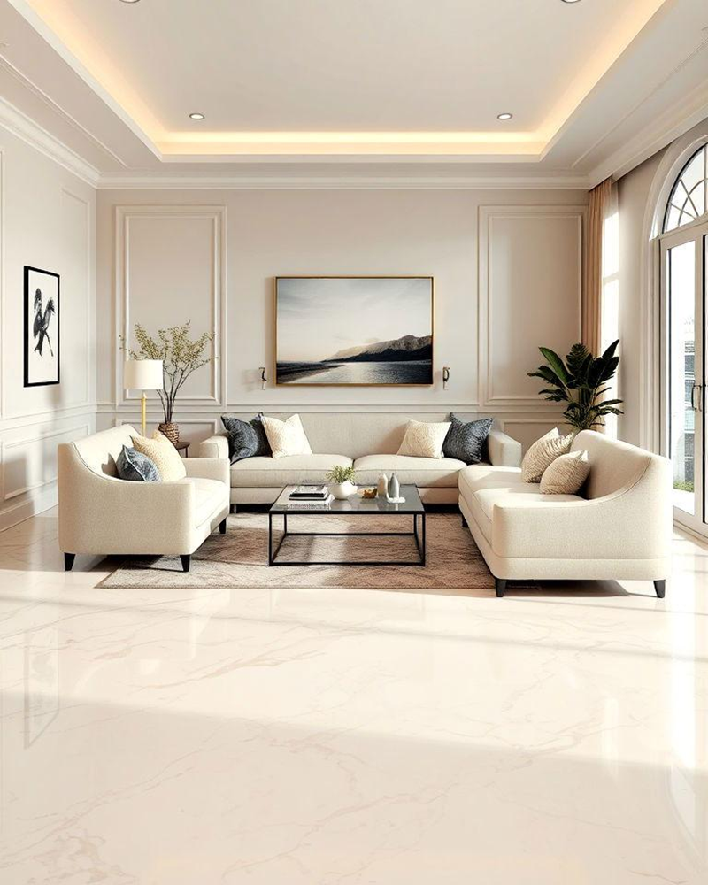
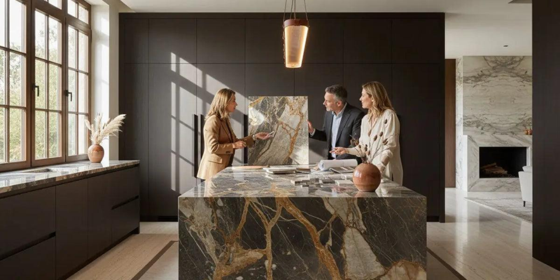
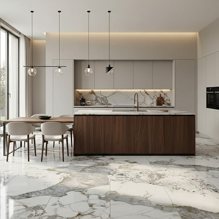
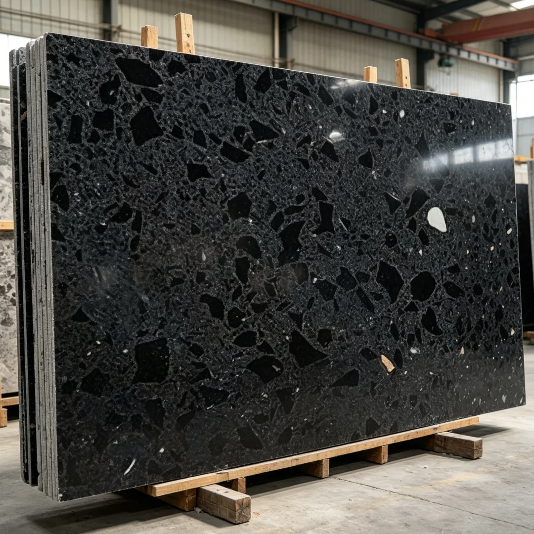
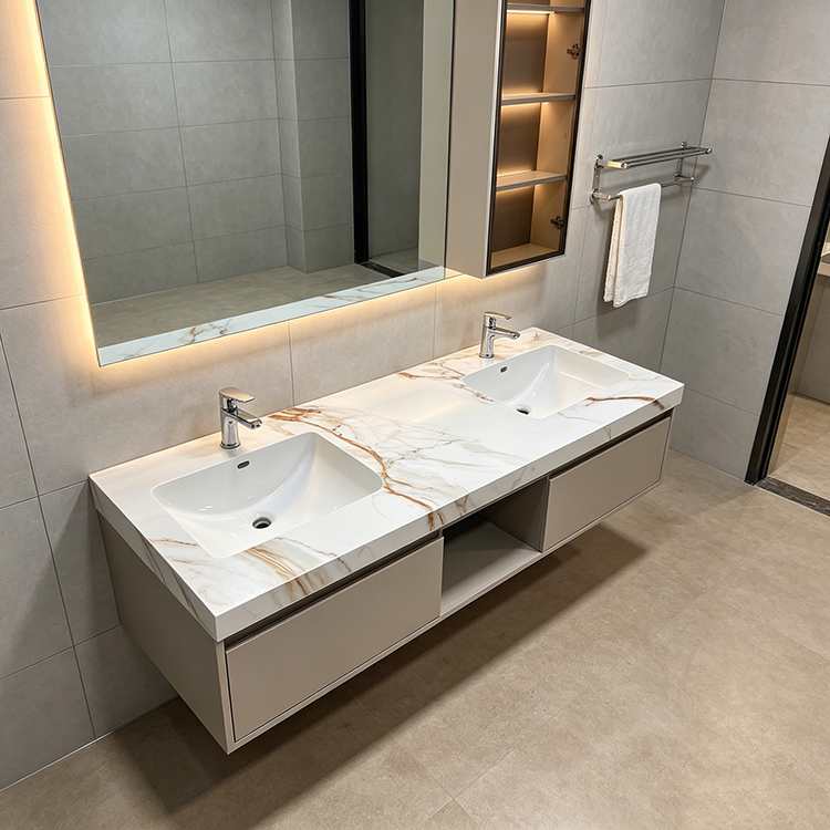
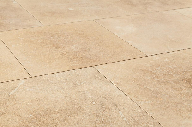
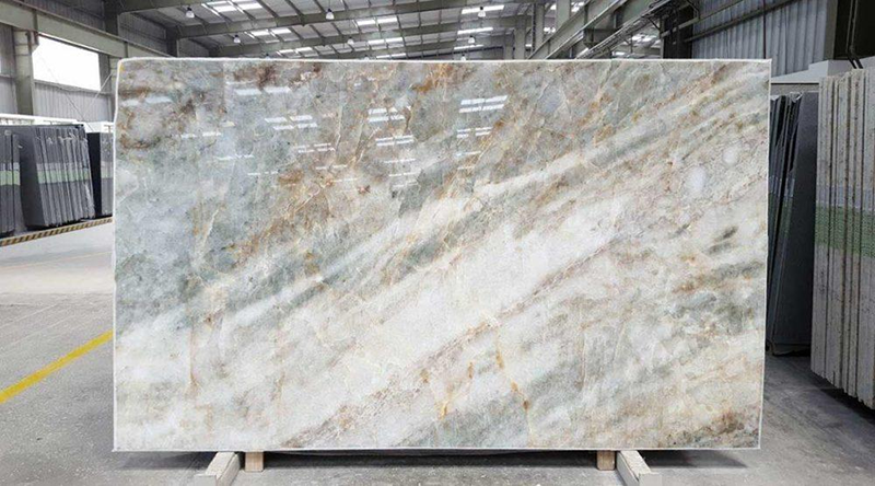
Beige isn’t a single note—it’s a spectrum. Quartzite glows differently than limestone. Travertine breathes. Marble, when cut right, almost drifts between tones.
And here’s the interesting part: beige behaves differently under light. Morning light softens it. Artificial light sharpens it. Same slab, different personality.
Material nuances that matter
Strange, isn’t it? A color once dismissed as “safe” now carries far more complexity than expected.
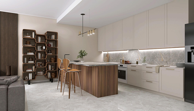
Calling beige “neutral” misses the point. It’s not passive. It negotiates.
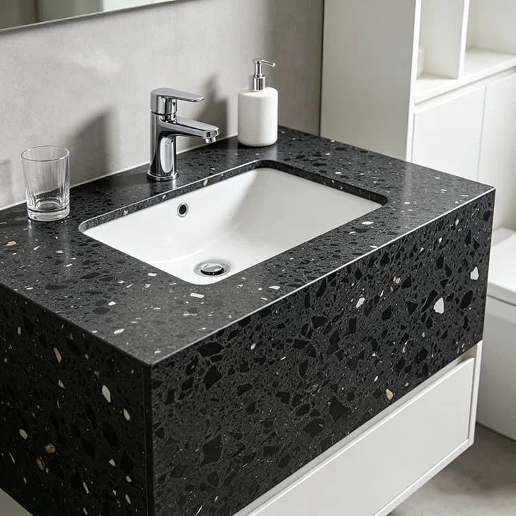
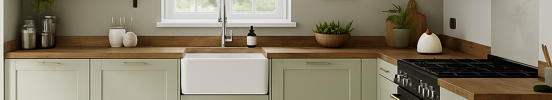
Pair it with walnut—suddenly it deepens. Add brushed brass—it warms further. Introduce black accents? It sharpens, almost unexpectedly.
Designers aren’t using beige as filler anymore. They’re deploying it.
Where it quietly excels
It doesn’t steal attention. It redistributes it.
Walk through recent projects. Or better—listen to what clients are asking for.
Not “neutral.” Not “light.”
“Warmer. Softer. Less cold.”
That distinction matters.
What’s driving the shift on the ground
There’s also a practical angle. Beige quartzites, especially the more stable varieties, offer consistency. Fewer surprises during fabrication. Fewer complaints after installation. That counts.
A lot.
So—are warm tones replacing grey?
Not exactly. That’s too simplistic. What’s happening feels more like a recalibration. A slow pivot away from something overly rigid toward something… breathable.
Beige doesn’t try to impress. It lingers instead. Quietly adaptive. Occasionally underestimated.
And maybe that’s why it works.
Because in the end, the best materials aren’t the ones that shout.
They’re the ones you don’t get tired of looking at.